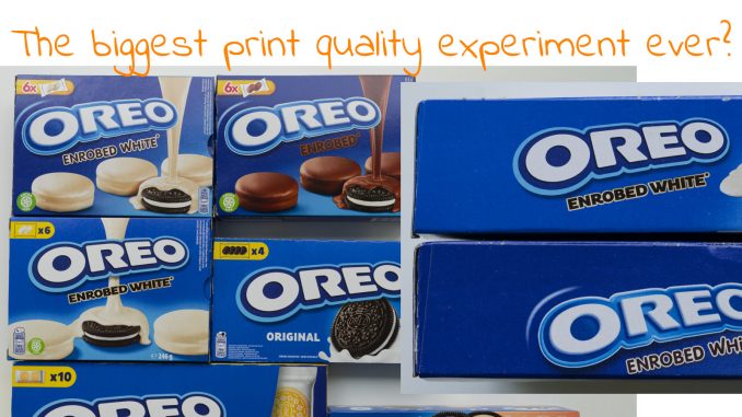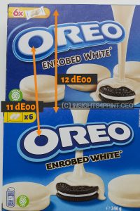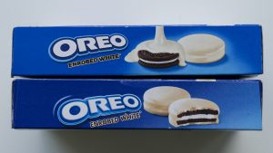
In a previous blog post we discussed a more theoretical study about the influence of small color deviations. But here’s something new, and real-life: Oreo is in the process of updating its logo AND brand color… When measured, the difference between old and new brand color is over 10 dE00! That should plummet their sales, isn’t it? But based on frequent shop visits, that doesn’t seem to be the case: the rotation of Oreo products stays at a very high rate. Even though old an new logos and brand colors are used next to eachother…


Read all about this in this article at the insights4print.ceo blog!
