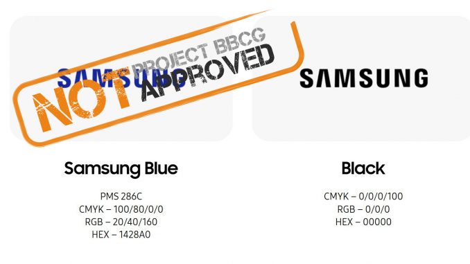
The second famous brand in our series evaluating brand color guides is Samsung. Their brand color guide has two colors, and the description is at least better than the one color from Apple (which only states ‘black’, which is not a good choice, as shown in this blog post).
The official page on ‘Color & Typography’ only shows basic information, no color codes. But on the page with the ‘Lettermark colours’, color codes are mentioned.
The Samsung Blue is described as follows: PMS 286C, CMYK – 100/80/0/0, RGB – 20/40/160, and HEX – 1428A0. Samsung Black is CMYK – 0/0/0/100, RGB – 0/0/0, and HEX – 000000. These official Samsung brand color specifications are flawed, they are not Project BBCG-approved.

The Samsung Blue has the following issues:
- PMS values as the first brand color specification is not a good idea. It might look convenient, but the Pantone system has flaws: the color guides that every designer and printer uses are NOT the reference. The reference is the Pantone database. The printed color guides try to approach that color, but these have deviations. The tolerance Pantone claims is 2 dE00, but tests have shown that this can be more, as shown in this blog post on insights4print.ceo. Meaning: what you see in the guide is not the ‘perfect’ or reference color, it’s already slightly different. Using a printed color guide as a reference will lead to discussions, to troubles. BTW: Samsung only mentions the C value. Don’t they print on uncoated paper? You will not get that 286 C blue when printing on uncoated paper. It will look different, that’s why Pantone also has printed color guides for uncoated paper.
- CMYK: compared to the Apple brand guide, it’s good that they mention CMYK values. But are these percentages for both coated and uncoated, so identical for both paper types? Applying the same percentages of ink to coated and uncoated paper will give a different color. BTW, let’s get real: coated and uncoated paper will always give a different visual impression, that’s just the nature of different substrate types. If Samsung deliberately chooses to use only one specification for both coated and uncoated, that’s OK. But it has to be a deliberate choice, not negligence or ignorance. Print color geeks might freak out now; they always want a perfect color match between different prints, but it’s Samsung’s choice how they want to deal with it. But please keep in mind that if you choose to use only one CMYK color definition, you are not allowed to complain about color differences between the color printed on coated and uncoated paper!
- RGB: these numbers are meaningless, literally. As mentioned in this blog article, you need to specify which RGB color space you use. And there are many, with sRGB and AdobeRGB being the most common. Why this is an issue: use the same numbers in a sRGB image and an AdobeRGB image, and you will get different colors. Sometimes slightly different, sometimes quite different. That’s why it is essential to mention which RGB color space these values are for. It’s kind of like if you live in the border region between Canada and the USA: when talking about dollars, you always need to specify whether it’s Canadian or American dollars, they are similar, but not the same… I must admit that in this case, the difference between sRGB and Adobe RGB is minimal. People who are not used to looking at color critically might not notice. But that’s not an excuse to forget to mention which RGB is used! Please make it a good habit to specify it!

- HEX: the same issue as sRGB. In case you didn’t know, HEX is the same as RGB but has a different encoding: hexadecimal. This way, you only need 6 digits instead of 9 in ‘regular’ RGB to describe a color. In a time when bits were costly, and storage capacity was minimal, this made a huge difference (to put things in perspective, the first PC I had at the office had a 30-megabyte hard drive…) But, being an RGB, you need to specify which RGB. Usually, it’s sRGB (since used for websites), but it’s not by definition sRGB… So, please always mention the color space!
The Samsung Black has one important point of attention: the CMYK values. It’s not wrong, but 100% black is not the deepest black you can get. If it is a deliberate choice to use only black, no problem! See the blog post on the Apple brand color for more information on printing ‘black’.
How to fix this?
It’s not that difficult to fix this. First, create a rock-solid, science-based primary color definition. Do this by measuring a sample of Samsung Blue that is a correct reproduction of the brand color you want, and use that measurement as the primary color definition (e.g., in Lab values). All other color definitions can be derived from that.
Make sure to mention which RGB color space these values are for: sRGB or AdobeRGB. What’s even better is to mention the correct codes for both! That way, it will be immediately clear for every designer and draw their attention to the difference between both! It will create awareness of this fundamental element of color definition.
And for the print values, please make sure to mention both coated and uncoated. You can use the same CMYK values if you like, but that has to be a conscious choice. When selecting a new brand color and creating the brand color guide, you might want to get some test prints, with different CMYK values to find the most optimal combination. In this blog post on insights4print.ceo you can find more information why definging the CMYK values for a brand color.
Regarding Pantone numbers, if you decide to use these still, you need to mention both the C (coated) and the U (uncoated) numbers!
For more information, please check the Project BBCG tutorial! It’s available in many languages!
PS: the website with 100 brand color guides has a link to an extensive Samsung ‘visual identity guide’. Unfortunately, I couldn’t find that one on the Samsung website, so I’m not sure this is correct and a current version. So, for this assessment, the colors published on the Samsung were used.
