If you want your brand colors reproduced within a certain tolerance, you rely on measurements to check this. But a small test with real life samples showed that this is not always as straigthforward as you might think, certainly not if you target tiny tolerances.
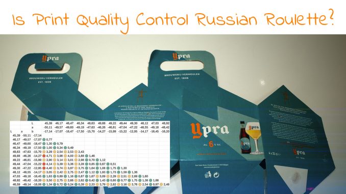
In this article at insights4print.ceo you can see an example of a nice 4-pack of beer. It looks nice, no visible issues. But when a dozen spots of the same color were measured, deviations became visible, even over 4 dE00! Also when a second sample was measured.

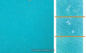
The deviation is due to a print issue that is hard to control: mottling.

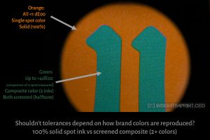
Plus: the brand color was reproduced as a combination of two different screened inks… And here it gets even more intersting: for the low-alcohol version the two brand colors are switched, the orange is the primary brand color. And that one is within tiny tolerances… How was this achieved? It’s not only a spot ink, it’s a solid spot ink (100%). This will eliminate multiple possible causes for color differences, like dot gain and registration errors (yes, registration errors can cause color differences).

So, here is some food for thought: shouldn’t tolerances depend on how your brand color is reproduced? Spot color versus composite color? Solid vs screened color? And certainly: the substrate used… a nicely coated paper and an uncoated paper have different properties, they will act differently when ink is applied to them.
Read more about this little experiment on insights4print.ceo!
