
The third brand guide on this list is the one from Cisco. And it’s an interesting one, but, again, not Project BBCG approved…
The full brand color guide, which the blog links to, is located in the author’s Dropbox. And I can’t retrieve it on the Cisco website. But when searching a little bit, I did find a document showing the Cisco colors.
And the same issues as in other brand color guides return in this one:
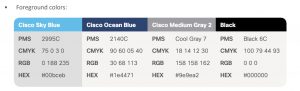
- A Pantone number is used as the primary brand color description, and only the C number is used. Don’t they print on uncoated paper?
- RGB values without stating which RGB: sRGB, AdobeRGB
- CMYK values without stating which CMYK, e.g., for coated and uncoated.
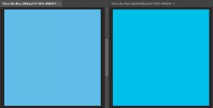
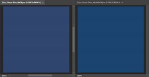
If you wonder why it’s necessary to state which RGB these values are for, check the two screenshots below. In both images, the left part shows the values from the table above when used in sRGB, and the right part when used in AdobeRGB. Not quite the same, isn’t it? More on this crucial issue in this blog post.
As I already mentioned in the post about the Samsung brand colors, using only one mixture for both coated and uncoated might not be an issue, on the condition that it was a deliberate choice. If it was ignorance, it’s a failure.
So, if you opt for just one CMYK mix, that’s fine, but you should mention this. It might upset print-oriented color geeks, but if it is your choice as a brand owner, it’s okay. But please be aware of the consequences: the color will look slightly different when printed on coated and on uncoated paper (and again, for the record: coated and uncoated paper will always result in a different color perception, due to the nature of the substrate, its surface).
But there is also another thing with these CMYK values, take a close look at the values of the first one, the Cisco Sky Blue. That has a 3% Y in it. In theory and on a screen that might look a good idea, it provides a unique twist to the otherwise Cyan color. Except that in print, maintaining a 3% dot consistent can be very, very hard. In some cases, it might disappear. In other cases, it might become 5% or even 8%. This isn’t a ‘print safe’ color combination. Eliminating that 3% could significantly improve the consistency of that brand color in print.
The same goes for that 5% Y in the Cisco Ocean Blue.
The Cisco Medium Gray 2 is also an interesting one: it is built with all four inks. Which could again be a challenge in print: you need to control the CMY inks within a very tight tolerance, otherwise, that neutral gray could become a non-neutral gray.
There is a way to make it easier to reproduce that Medium Gray: GCR (Grey Component Replacement). The ‘overlap’ of the 18% C, 14% M, and 12% Y is gray. So, the trick of GCR is to replace that overlap by increasing the percentage of K (black ink).
(okay, I have to mention that the percentages you need to elimate are not exactly identical, they are slightly different)
You can eliminate the Y in the Medium Gray: 2 / 2 / 0 / 45 will give the same Lab-values and has one less color to keep under control.
But then we return to those small percentages, which could also be challenging to maintain consistency in print… To get a really print-safe color, it would be better to use only black ink. The mixture 0 / 0 / 0 / 47 is visually very close to the original one and will always be neutral gray.
How to fix this?
It’s not that hard to fix this: specify which RGB these numbers are for and use a more print-safe CMYK mixture. And state explicitly that the CMYK values are for both coated and uncoated. If Cisco prefers specific values for coated and for uncoated paper, they should test which values are the best combinations, not only by looking at a screen, but also by doing some small test prints.
And make the basic color definition a rock-solid one: use Lab-values, e.g., by measuring the colors you like.
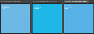
UPDATE 26/10/2024: Since more and more monitors and laptops have a DCI-P3 gamut, here’s an update of the Cisco Sky Blue, shown with three different profiles: sRGB, AdobeRGB and DCI-P3… This clearly shows why you should state for which color profile, color gamut these RGB values are intended…