Big brands spend a lot of money on creating their brand, including extensive brand guidelines, showing how the logo can and can not be used. In a new series of blog posts, we will look at the brand guidelines from well-known brands. And to start this series, let’s look at one of the most famous brands: Apple.
If you look online for examples of brand style and brand color guides, you can find a lot of lists with examples of the ‘best’ brand style guides. This blog post has a list of 100. We’ll use this list for this series of blog posts.
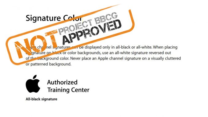
So, first on that list is Apple, one of the most iconic brands and specifically known for the attention they pay to design. Here are the official Apple Identity Guidelines For Channel Affiliates and Apple-Certified Individuals. And, of course, there is a mention of the color that can be used: “Apple channel signatures can be displayed only in all-black or all-white.” That’s easy, isn’t it? It’s just black and white? Well… not so fast…
The digital representation of both is straightforward: black is 0 / 0 / 0, and white is 255 / 255 / 255. And these are the same in AdobeRGB and sRGB. Unless the designer likes a different ‘black’ more and does not take that 0 / 0 / 0 as the specification of black. Defining which codes must be used in RGB, plus specifying which RGB is used, would be better, even though, in this very specific case, AdobeRGB and sRGB won’t make a difference. But we should create a habit of consistently specifying RGB as AdobeRGB or sRGB: for colors other than pure black and pure white, it does make a difference. There is more about that in this blog post.
But what about ‘black’ in print? That’s where things will go wrong…
To start, the simple solution, using only solid black ink (100% K), might not provide the intended visual experience. It’s just not that dark… If you want a dark black, you need to add other inks. I hear you think: let’s use 100% of all inks! As long as you live in a digital environment or the realm of scientific color values, that might seem the best solution. But it’s impossible to print this properly: it’s just too much ink! There is so much ink that it will take a long time to dry. And if the ink is not dry, it can set off to the back side of the sheet that lies on top of it… This article and the image below show what can happen when ink isn’t dry.

So, what should we do if 100% K and 400% are not good options? Well, there is a concept called ‘rich black’. This is where another color is added to make the black appear darker. And that really works! Unfortunately, there are several options: when adding Cyan, you will get a ‘cold’ black. When adding magenta, it’s a ‘warmer’ black. Meaning: there are different varieties of black… In the case of Apple, an electronics company, I can imagine that a cold black would be preferred.
If you are a bit familiar with ‘color management’, like in Adobe Photoshop, you could argue that you just need to use, to trust that conversion from RGB to CMYK. It’s color science, isn’t it? Well… it indeed is color science, but it has some variables you need to take into account. The most important one: the destination ICC profile. This is kind of translation dictionary that is being used. And when you use a different dictionary, you might get a different result.
Let’s check what that pure black in RGB will be transformed into using two different CMYK coated profiles:
- PSO Coated v3: 83 / 67 / 51 / 95
- CGATS21 CRPC6: 84 / 75 / 61 / 99
You see? When using different destination profiles, the CMYK mix will be different. And a mix of all colors, that’s something you should be careful about: when one of the colors deviates a bit, the visual impression could go from a neutral black (our starting point) to a tinted or colored black… That’s why Project BBCG promotes specifying a specific CMYK combination upfront and doesn’t rely on color management to transform brand colors from RGB (or Lab) to a specific CMYK.
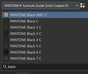
And one more thing about using just ‘black’ as the brand color description: if you look in the old Pantone color guides, you will find multiple colors named ‘black’. Here is a screenshot from Affinity Designer when looking for ‘black’ in the Pantone Formula Guide Solid Coated V5 (yes, in Affinity tools, those libraries are still available, at no extra cost).

How to fix this?
Apple should use more solid specifications for its signature color; just saying ‘black’ is not a solid brand color description. This might – or probably: will – lead to problems in print production, where the reproduction of that black will deviate between different designs and print runs.
The Project BBCG approach uses a scientific description as the primary brand color definition (so: in Lab or LCh values). Conversion to a specific RGB can be done with color management, which is straightforward. For reproduction in print, specific values should be researched, visually evaluated and defined. For example, a ‘cool rich black’ might be appropriate for Apple, 40% C and 100% K might be a good option. Checking which combinations are best in print, based on test prints, should be part of building a brand style guide.
Here are several blog posts that explain some important aspects of brand color guides: color management explained for designers and brand owners, the necessity of sharing your brand color guides, how you can exchange brand color specifications via ASE files, why you should have a ‘color exchange coordinator’, designing black for print
And of course don’t forget to check out the complete Project BBCG tutorial! It’s available in 15 different languages!
