Too many discussions about print quality are not due to print quality. That might seem a strange claim, but it isn’t. Many print quality discussions originate in flawed brand color definitions. And these lead to a gap between expectations and execution in print.
But this also means proper brand color definitions could easily prevent them. And that’s what Project BBCG – A Better Brand Color Guide is about. Don’t run away! It’s not as difficult as you might think. You need to understand some basic technical details, but these will be explained in a very basic and often visual way. Everything Project BBCG publishes is with brand owners, designers, and print buyers in mind.
So, where do you start when you have chosen that new brand logo and color? With a rock-solid, unambiguous description of that brand color. And that’s where it (often) already goes wrong. Too many brand colors are defined as a Pantone color, which is a proprietary color system, with some flaws. Or even a HEX code, which is used to code colors on the internet. These are not the brand color definitions you need.
What you need, is a science-based brand color definition. The most often used one is CIELab (or Lab in short), but it could also be LCh. And although this might seem complicated, it’s like your scale at home, when you weigh yourself. This scale will show the results in a specific unit: kilograms, which is a science-based definition of weight. How does the scale measure this? I don’t care! As long as it produces a consistent measurement and the number it returns is something everybody interprets the same way, I really don’t need to know. I only need to check whether the settings are correct and that it measures in kilograms, not pounds. The formula to concert kilograms into pounds? I don’t need to know, I only need a reliable tool do to that for me.
When talking about colors, that scale is replaced by a spectrophotometer. It works similarly to the human eye and will translate the color it sees into a set of numbers. And that set of numbers you get, when you measured the color swatch you picked as THE perfect color for your brand, that should be your basic color definition. That measurement is where it all starts. That definition is where all codes to reproduce the brand color are derived from.

Starting your brand color definition with the measurement of the color you picked, will lead to fewer discussions afterwards.
For a full explanation of how to work from here, please check out the tutorial file! In addition to English, it is available in 14 other languages!
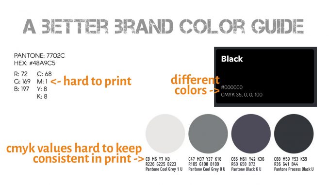
But let’s make it very practical and look at the examples in the image at the top of this blog post!
The one on the top left: a 1% (or even a few %) in any of the CMYK values will make it hard to print. That 1% might get lost, or could become 2 or 3% due to ‘dot gain’. In both cases, it will look slightly different. A best practice is to avoid these small percentages.
Top right: HEX #000000 and CMYK 35, 0, 0, 100 are different colors. The first is a neutral black, the print values have a visible cyan tint. It could be on purpose, but it could also be a mistake. If you want to know more about black in print, check out this article: Not all black is designed equal.
The bottom row, with all these greys, these are hard to keep consistent when printing in CMYK. I already mentioned ‘dot gain’, which means that a dot on paper will look a bit different from the ideal value on your computer. E.g. that first one, ‘Cool Grey 1 U’, which is composed of Cyan, Magenta and Yellow, if one or two of these three inks deviate a little bit, you will get a very different tint of grey, e.g. a warm grey. The better way is to build grey tints with the Black (K) ink and add one of the other ones. In theory, 0 / 0 / 2 / 11 will give the same color and this will be easier to control. Except for the fact that the 2% yellow might become a bit larger… This is always a risk with close to neutral tints! You might want to pick the safe way and go for neutral tints, only K in this case. More about small percentages in a brand color in this article: Brand colors in CMYK: better safe than sorry and in this follow-up article: Brand colors: better safe than sorry (again)
And if you want to know how to create rock-solid brand color guides, check out the Project BBCG tutorial to find out more! And if English is not your native language, check out the available translations!
PS: spectrophotometers used to be very expensive, but they have become much more affordable in the past few years. The cheapest devices at the moment of writing are Nix Spectro L (+/- 450 euro), Nix Spectro 2 (+/- 900 euro), and Epson SD-10 (+/- 550 euro). There are cheaper devices, but these are (probably) colorimeters, not spectrophotometers. Colorimeters work in a different way. You should spend a little bit more money and use a spectrophotometer if high print quality is essential. Also, the construction can be slightly different, which could lead to differences in measurements. The ones mentioned above are developed for print quality assessment.
